Many organizations are happy to harbor a set-and-forget mindset after they’ve invested in something. It could be equipment, real estate, a strategy — anything, really. They believe that wringing out every drop of value from it is the most prudent path they can take, even when today’s costs cast a shadow over yesterday’s value.
This is the sunk-cost fallacy — and it applies to content, too. A communication you spent a lot of time and money developing ten years ago may not do any harm today, but that doesn’t mean it is effective, engaging, or aligned to modern needs and expectations.
If periodically reviewing all of the communications you send isn’t part of your routine, then you’re missing out on some big opportunities to improve customer satisfaction and deliver on business objectives. Read on to see examples of how I applied continuous improvement to an important communication and how the approach I took benefited everyone involved.

The starting point
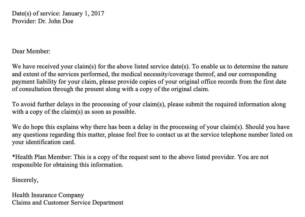
A major health insurer used to send the letter shown below to its members — more than 3.5 million of them annually. It is an operational communication, which means the insurer must send it to its members, when applicable, because it informs members about the status of their health plan. Operational communications do not sell anything.
Please take a moment to read the letter. Keep in mind that the example is cleansed of brand-specific elements, colors, contact information, names, locations, and similar details.
Ask yourself these questions as you read:
- What is the letter about?
- What, if anything, must the recipient do after reading the letter?
- Would you stop reading and call the insurance company for clarification or help? If so, when?

Examining the issues
This letter uses technical jargon. It lacks brand voice, and it carries a legal or contractual tone. The communication doesn’t focus enough on the member. The letter is confusing. Only at the end does it tell the member that it’s just a copy of the communication the insurance company sent to the member’s doctor!
The letter buries the lead (lede for the journalists out there). In doing so, it fails to meet members’ functional and emotional needs.
- Functional: the understanding needed to take appropriate action in the situation
- Emotional: the feelings needed to believe in oneself in the situation
The communication requires a lot of cognitive horsepower to process — especially in the beginning. Those who felt fatigue early were likely to call the insurance company for a better explanation of what they needed to submit.

The first revision
Let’s take a look at the initial overhaul. The communication’s purpose is the same, but the messaging is completely different.
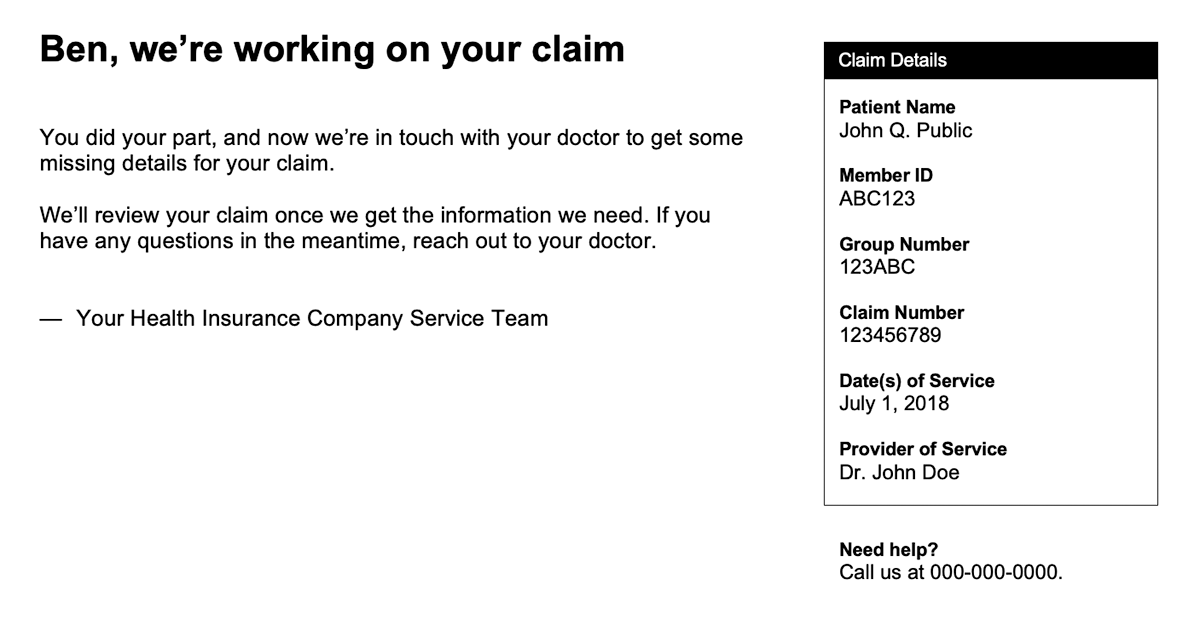
Please take a moment to read the first revision. The communication is cleansed of brand-specific elements, colors, contact information, names, locations, and similar details.

Now that you’ve read the letter, answer the questions from before:
- What is the letter about?
- What, if anything, must the recipient do after reading the letter?
- Would you stop reading and call the insurance company for clarification or help? If so, when?
A look at the enhancements
The new letter addresses the issues we saw in the original. For example, it makes its purpose clear immediately and conveys a much more casual tone. But there’s plenty more to enjoy. The communication also:
- Replaces most of the technical jargon with plain language.
- Introduces brand voice.
- Includes deeper personalization.
- Clarifies the action needed and who is responsible for taking action.
- Provides next steps.
- Uses nearly 66% fewer words to share the details the member needs.
- Presents claim information the member might want or need to reference — and does so without getting in the way of the communication’s intent.
The communication now lets the member know what’s going on with their health plan in a way that is easy to understand, that values their time, and that prevents them from taking on work that isn’t theirs to do. It shows true content evolution.

The latest revision
The first rewrite is a wonderful example of what happens when an organization follows through on its customer-first promises. The letter, like many other communications I reworked for the company, improved member experience and satisfaction.
The latest revision builds on the goodness we find the first one and brings a key business objective into the messaging. Some background: The health insurer invested in chat technologies and, not surprisingly, wanted to promote them in hopes of seeing ROI quickly.
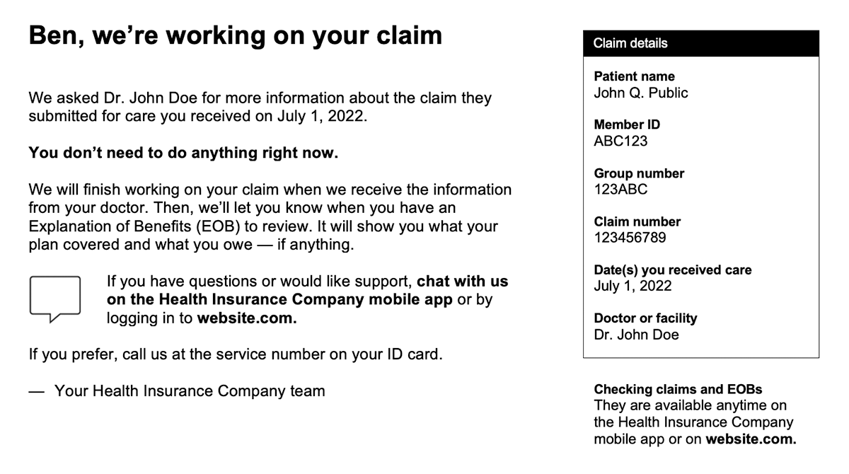
How do you accommodate an important business objective while still taking care of the customer first? Check out the example below. The communication is cleansed of brand-specific elements, colors, contact information, names, locations, and similar details.

The latest improvements
The most recent revision introduces the chat option — and it does so in a way that fits nicely with the rest of the content. The communication replaces what remained of the technical jargon from the previous revision with plain-language alternatives that emerged from mixed-method research I led. The letter also:
- Reflects the company’s adjusted brand voice (conversational but less casual).
- Includes more personalization.
- Provides next steps and ownership of action in greater detail.
- Explains how to find related information and documentation online.
- Offers multiple ways to connect with the company.
The letter balances audience needs and business objectives — an outcome that requires a high degree of collaborative and inclusive leadership to realize.
The value of continuous improvement
Consumer and business needs change. Committing to continuous improvement not only means being flexible enough to adapt, but also being proactive in looking for ways to stay ahead. Regular reviews and enhancements — whether it’s content, internal processes, customer journeys, or something else — will enable you to profit from change instead of simply reacting to it.
If you have questions or would like more information, please contact me.

