I headed into a Kroger grocery store for some cold cuts and ended up part of an experiment. Don’t worry — it wasn’t invasive. Besides, a delicatessen is the kind of place where you really do want to hear the snap of rubber gloves.
The deli counter I expected was gone. The expansive installation pictured below had taken its place. I was happy to see something unexpected and to find new ways to score the sliced meats I had on my shopping list.
Boar’s Head is the brand behind the concept. A corporate trainer of theirs was on site during my initial visit. We talked for a bit, and I found out that my hometown is a test market. Of course, I just had to ask whether the company is gathering data on shopper preferences and their interactions with the different ordering technologies. “You bet we are,” he answered.
That’s when I decided I’d take in the whole thing from a variety of professional perspectives. And as a consumer, I felt that serving as a data point for Boar’s Head would be a small price to pay for olive loaf.
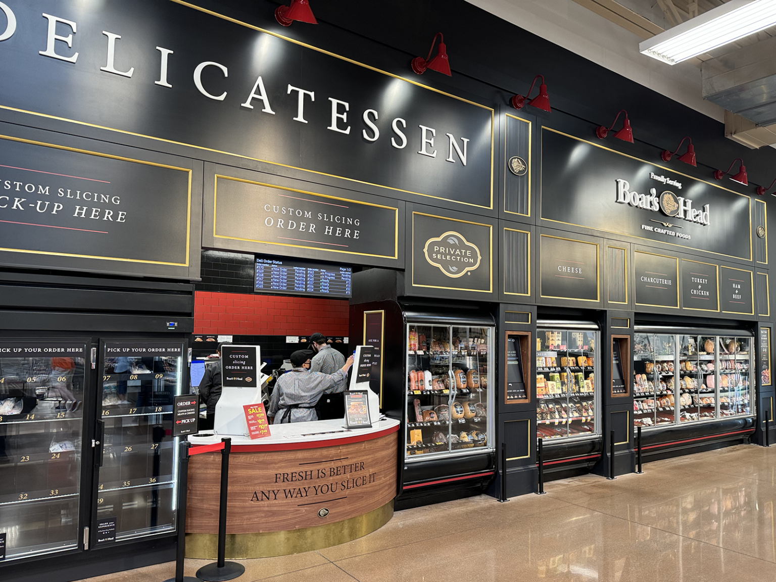
The Boar’s Head Delicatessen installation at Kroger
The installation’s look and feel make it stand out in the grocery store. A sensible layout and large-format signage aid in product selection and wayfinding. Shoppers have three options for placing orders, two of which are digital-first.
Why is this appealing?
The deli concept is a win for the consumer and a win for the brands that enjoy shelf space: Boar’s Head, Kroger (Private Selection), and possibly others. Shoppers now have multiple ways to order — touchscreens, QR codes, and face-to-face — and can do so in a visually appealing environment. Meanwhile, the choices shoppers make and the quality of their interactions with the different ordering processes serve as quantitative, longitudinal data for marketers and experience designers. Ultimately, the data will enable Boar’s Head and others to make high-quality decisions about products, ordering, in-store-presence, and more.
But there’s more to it than that. The concept shows that even something as constant as the grocery-store deli can change to accommodate modern preferences while simultaneously continuing its service as a faithful fixture. It’s also a great example of showing vs. telling. Boar’s Head doesn’t have to say that it’s interested in making the deli experience faster, easier, or more modern. The brand shows it throughout the installation.
Let’s also appreciate the fact that there’s no good/better/best model here. All three ordering experiences are essentially consistent with one another, which means it all comes down to subjective consumer preference.
Someone who favors technology can either use a touchscreen or their phone to build, customize, and complete an order. A handful of taps on a screen puts sandwich-ready liverwurst within reach. But no one is penalized with a lesser experience for choosing the face-to-face option — although breath freshness is a variable for everyone in the transaction to consider.
What kind of innovation is this?
The new deli concept is an example of component innovation: changes to certain aspects of a product or system. The installation and the ordering technologies are the most obvious changes to the long-standing system.
Visual merchandising deserves attention, too. No longer are the cheese and meat chubs (yes, that’s what they’re called — and yes, I’m all too happy to call them by their technical name) resting lengthwise. They’re now upright, showing off color, packaging, branding, and other elements that attract the eye and aid in product differentiation. We also see product groupings by category, such as charcuterie, where shoppers will also find complementary products — olives, for example. Smart cross-selling, Boar’s Head.
The prototype is unquestionably innovative in that it introduces a new set of ordering experiences in the context of a grocery store delicatessen. It doesn’t matter that touchscreens and QR codes aren’t new; it’s the integration of technology in what was previously a tech-free place that counts.
Touchscreens and QR codes are ubiquitous. Many who don’t want to fool with such fancy doohickeys still are likely to at least know what they are. And their ubiquity is a result of sustained, widespread engagement over many years.
The technologies Boar’s Head chose are compatible with many people’s current shopping preferences and behaviors. That compatibility improves the likelihood that people will adopt the innovation the next time they need a pound of thinly sliced mortadella.
Moving on. The deli installation doesn’t fit the definition of disruptive innovation. Here’s why.
First, the concept doesn’t introduce something completely new with the specific intent of opening a new market. Instead, it offers new features designed to increase consumer satisfaction in an established market and improve important performance trajectories for the business: sales volume and ticket size.
And second, it doesn’t sacrifice functionality that consumers value in order to enter a new market. That’s actually a good thing in this case. No one wants a trip to the deli to be difficult. Here, Boar’s Head wisely elected to maintain status quo while pursuing innovation in parallel.
Regardless, iterative design is at work here. Many of the issues I encountered during my visits stem from a minimum-viable-product approach to rolling out features and functions.
One last point. The prototype installation is rich in observability: the opportunity to see that the innovation works and how well it works. Boar’s Head will know soon enough, based solely on all of the interesting data they’re collecting, whether their innovation was successful. On-site traffic, sales volumes in X amount of time, use of the touchscreens, use of the QR codes, counter sales, ticket size, consumer sentiment, and lots more will tell the story the company needs to hear.
Now, let’s shift our attention to the ordering experiences.
Touchscreen
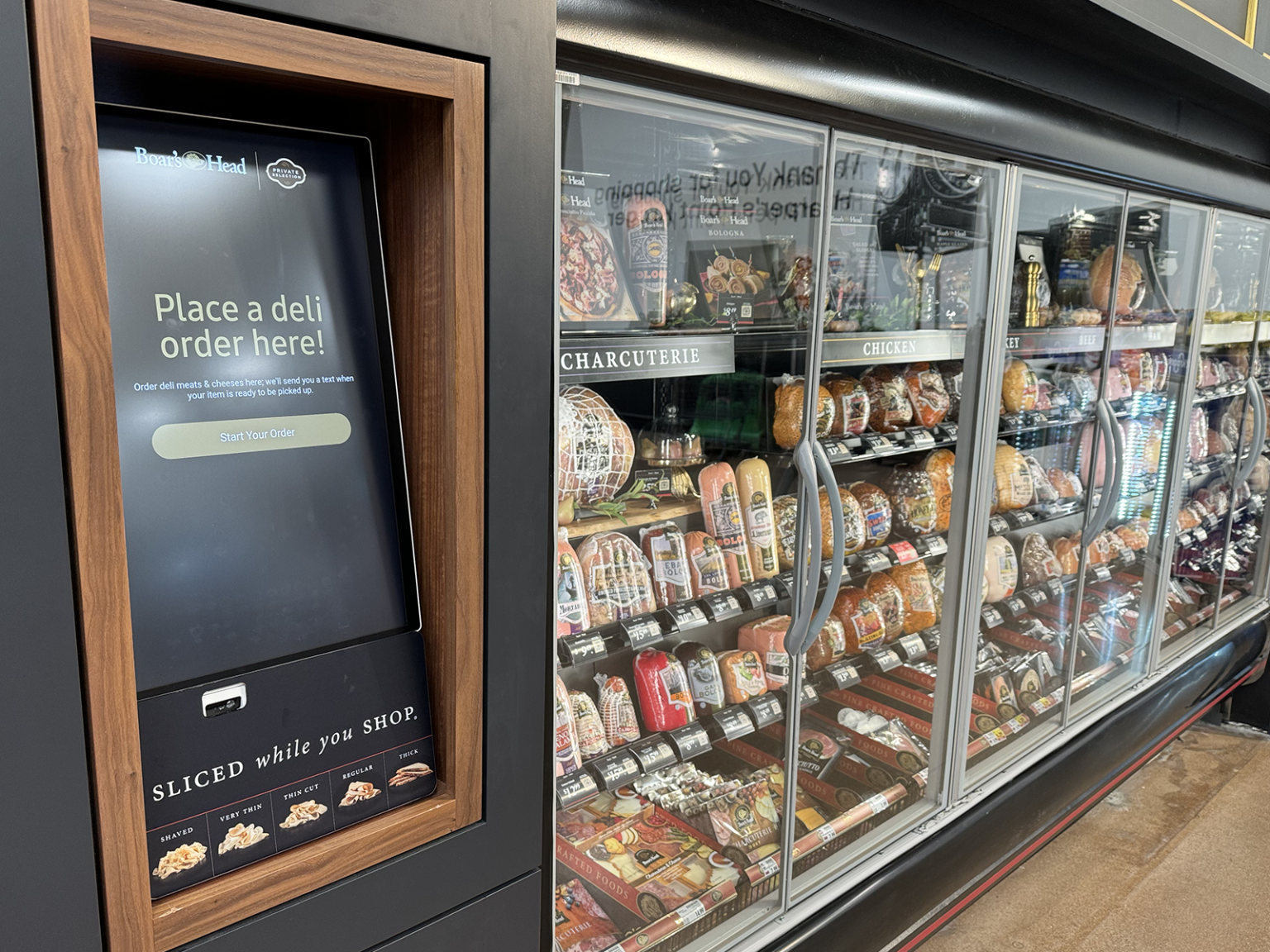
The touchscreen guides the shopper through the entire ordering process. Two stations are available. They feature large displays and present content in modular layouts with ample white space. Icons are large and accessible. Touch-response time is good.
Touchscreen experience
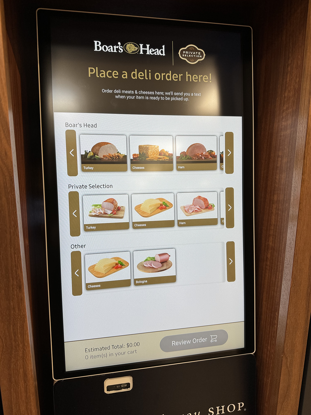
1. Select brand and category
The interface does a nice job of guiding the shopper. Images and icons make the experience intuitive.
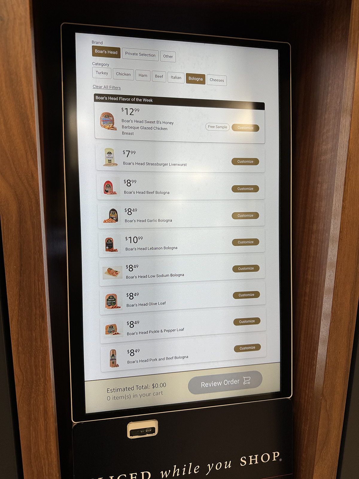
2. Choose the product
The menu displays product images, prices, and names clearly. One tap brings up the product-customization page.
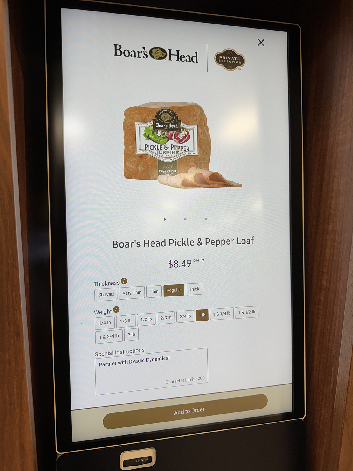
3. Customize the order
Customization is easy. Here, the shopper used the Special Instructions area to offer Boar’s Head excellent advice.
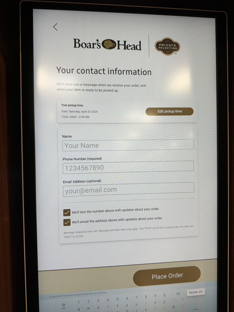
4. Complete the order
The shopper enters pickup time and how they’d like the deli to contact them when their order is ready. I opted for both and received neither.
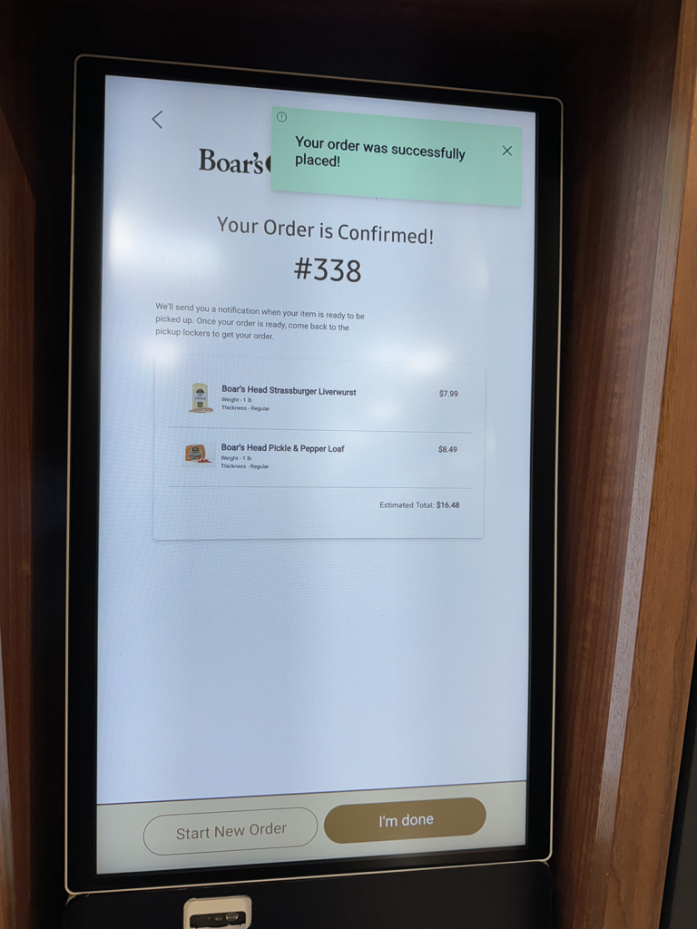
5. Order confirmation
The system displays an order number, a summary of the order, and a total price. The shopper can then enter a new order or end the process.
Touchscreen: pros, cons, unknowns
Pros
- Self-service
- Alternative to in-person ordering
- Does not rely on shopper-owned tech
Cons
- Potential for long lines
Unknowns
- What are shoppers expected to do if they have questions or encounter a technical issue?
QR code
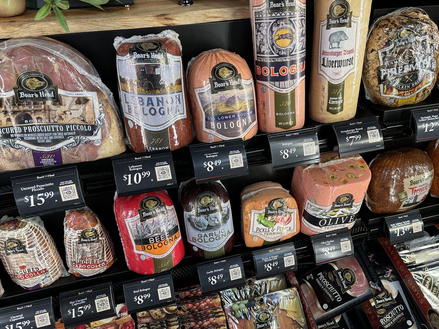
Each item’s shelf tag features a unique QR code that enables shoppers to create and place orders on their phones. Scanning through the glass refrigerator doors doesn’t work well. Open a door, and then scan. The web-based experience that follows a code scan is mobile-first and does a nice job of mirroring the touchscreen ordering process.
QR code experience
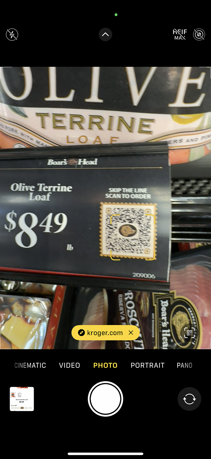
1. Scan the QR code
The process here is no different from scanning any QR code with a phone’s camera. Unfortunately, scanning through the glass doors was nearly impossible.
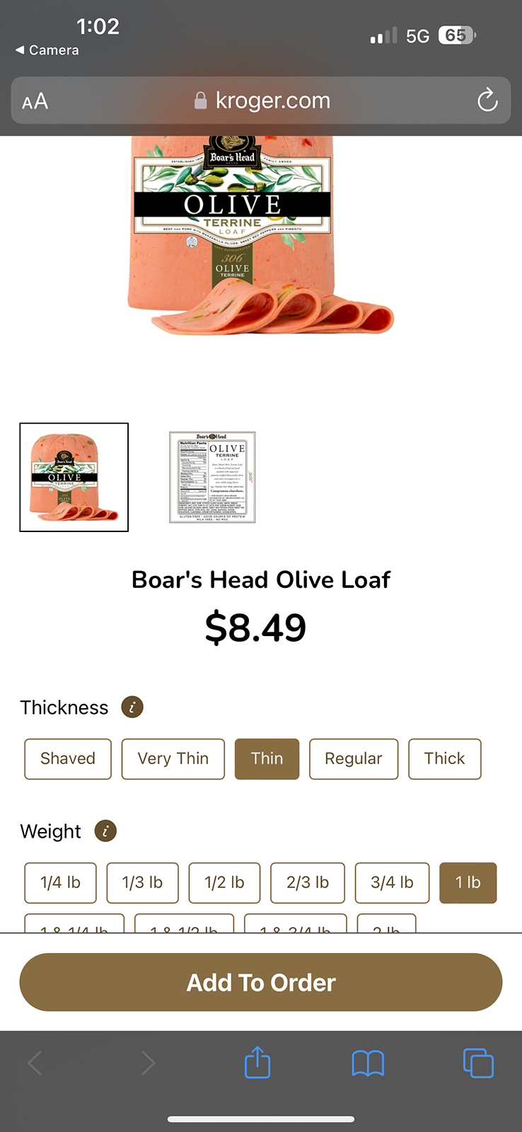
2. Customize the order
The web experience uses white space effectively and offers generously sized buttons — both of which make the customization process pleasant.
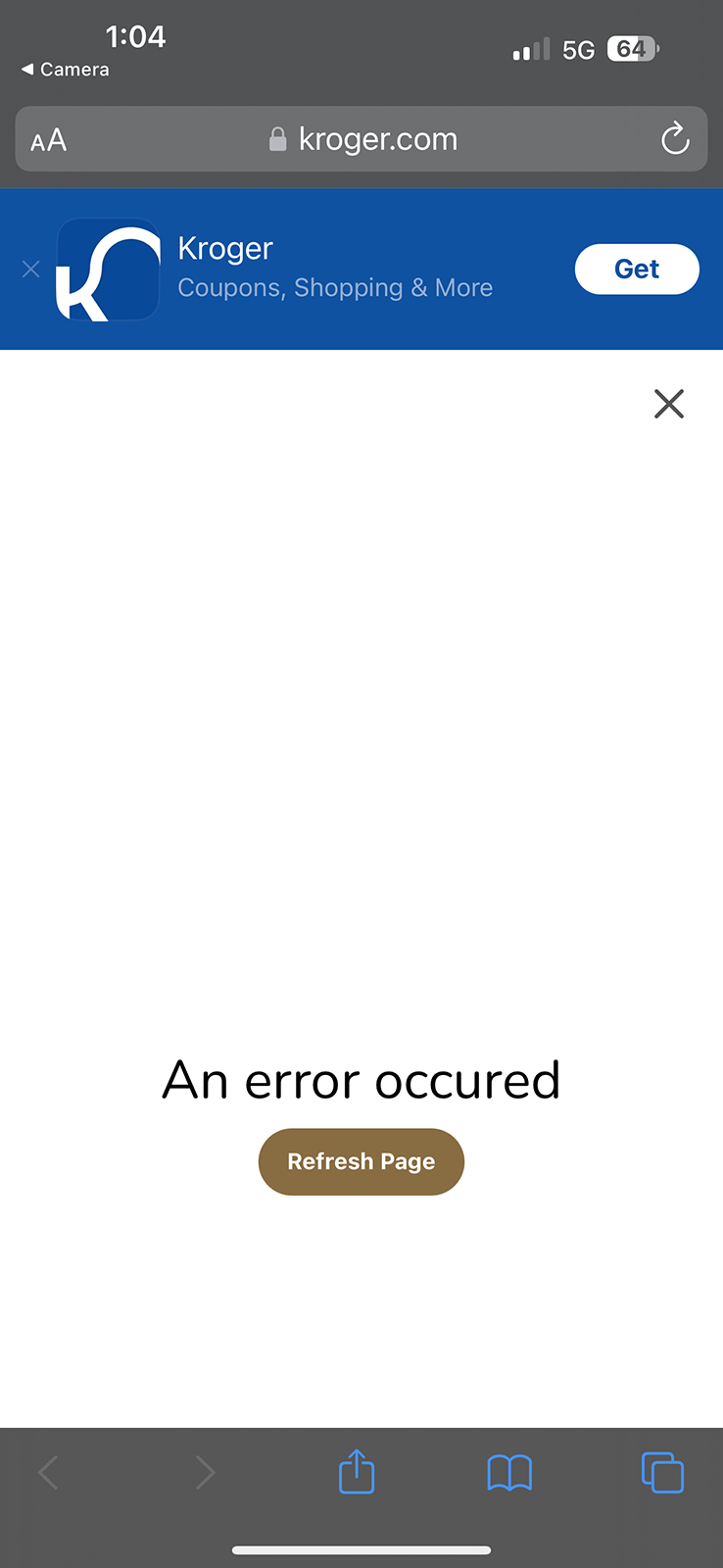
3. Frustrate the shopper
This is what happened when I tried to add some olive loaf to my order. The Refresh Page button did nothing. I had to restart my order. The word occurred is misspelled.
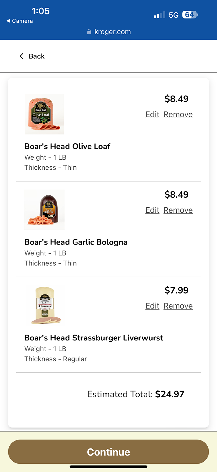
4. Review the order
The screen displays product choice, personalization, and price, legibly. The modular design looks great. The use of white space is effective.
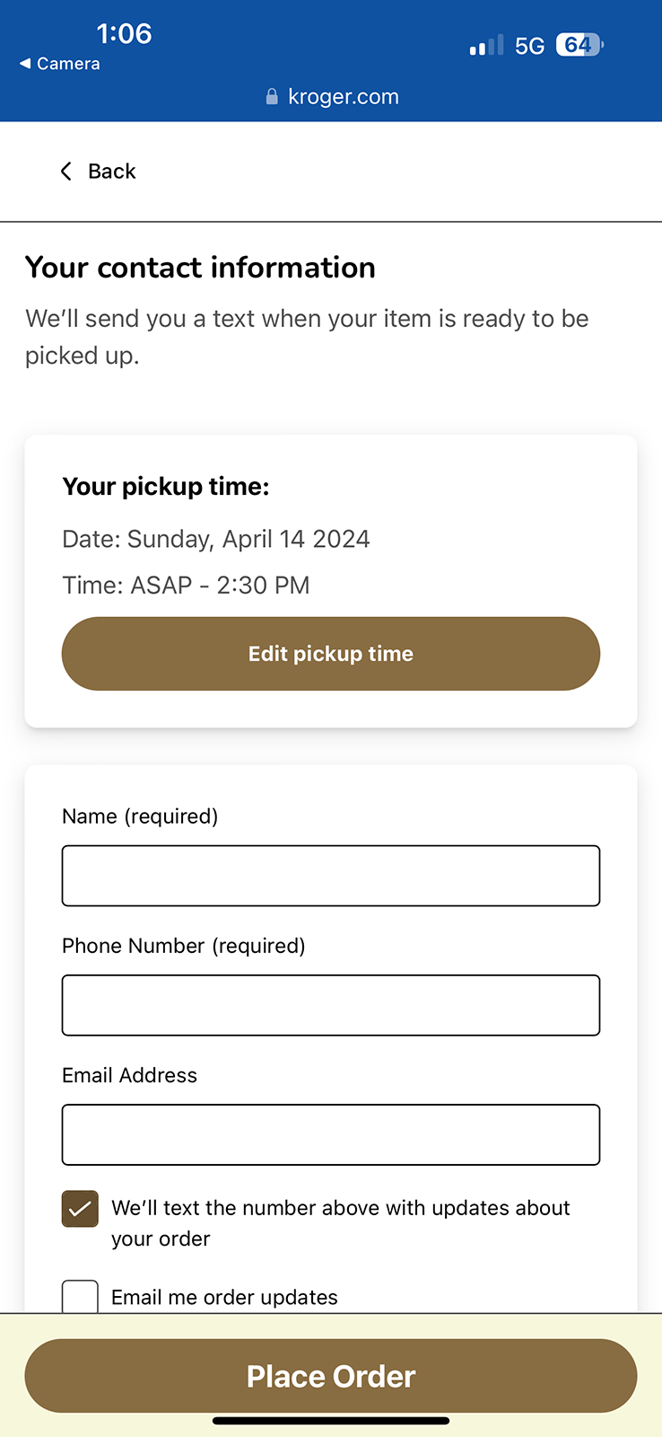
5. Complete the order
The experience mirrors the touchscreen. I opted for a text message to alert me when my order was ready. I did not receive one.
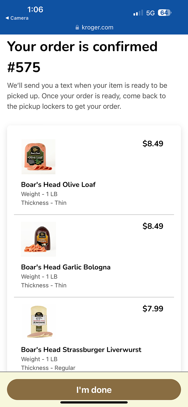
6. Order confirmation
The system displays an order number, a summary of the order, etc.
QR codes: pros, cons, unknowns
Pros
- Self-service
- Alternative to in-person ordering
Cons
- Relies on shopper-owned tech
- Inconsistent performance when trying to scan through glass doors
Unknowns
- What are shoppers expected to do if they have questions or encounter a technical issue?
In person
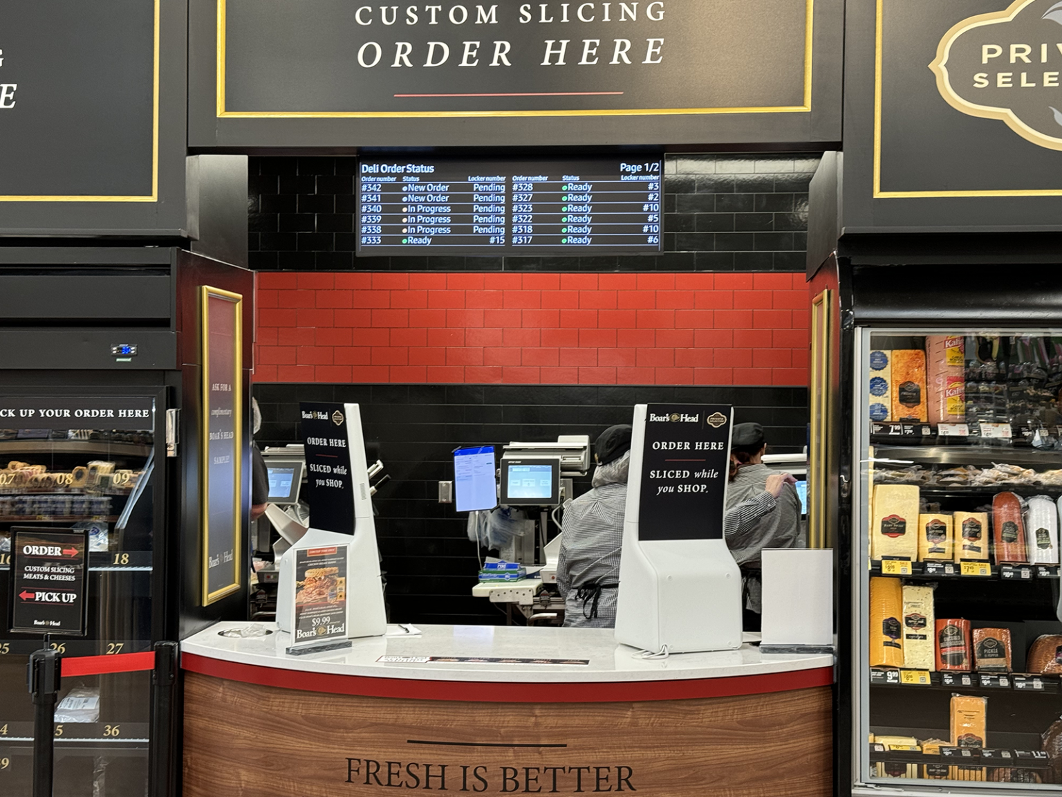
Those who prefer a more traditional deli experience can choose to place their orders face-to-face. The process is essentially consistent with the technology-enabled options. Of course, the big difference is that it’s a verbal, person-to-person transaction.
In person: pros, cons, unknowns
Pros
- Personal service
- Alleviates pressure of using unfamiliar technologies
Cons
- Potential for long lines
- Potential for human error on both sides of the transaction
- Interactions with frustrated customers who tried using the fancy doohickeys unsuccessfully — or who just want everyone to know that back in their day, people ordered their bologna at the deli counter
Unknowns
- None at this time
Critical assessments
Most of my experiences with the Boar’s Head deli concept were very good. Not everything was perfect, though. Here are some things that stood out.
Code scanning
Not being able to scan QR codes through the glass refrigerator doors consistently (or at all, really) was a little frustrating. Someone who wants or needs to operate their phone with two hands will have to open the door and prop it open against their body before they can scan a QR code.
Some consumers will feel that keeping the door open to scan items wastes energy. Even though this is a minor inconvenience for the average shopper, it’s still a barrier to participation in general and a deterrent when it comes to scanning multiple items.
System issues
Take a look at the QR code experience section above. You’ll see that a system error prevented me from putting my order together. I used the Refresh Page button, but that didn’t clear the error or return me to my order. I had to start my order over completely, which was inconvenient. It would have been significantly more painful had I already added several items to my order, and I would have abandoned the QR code option to avoid a repeat.
On-site support
Seeing nothing more than a Refresh Page button and a generic error message in which the word occurred was misspelled wasn’t good — but even worse was the fact that there were no instructions for getting help or returning to my order.
At the very least, I would expect to see an apology. Even better would be an apology accompanied by simple instructions for getting help and completing my order — even something as basic as: “We’re sorry our ordering system isn’t working as it should right now. A deli team member at the counter is ready to help you place your order.”
The best approach would be the apology, the instructions for getting help, and a message saying I’ll get a discount for the inconvenience. After all, the only thing better than pickle and pepper loaf is 10% off pickle and pepper loaf.
Order timing
You can see in the QR code experience section above that I completed my order at 1:06 p.m. You can also see that I selected ASAP to 2:30 p.m. for my pickup time. That was the earliest pickup slot available. ASAP is ambiguous, and 2:30 p.m. is nearly 90 minutes from my order time, which is quite a long stretch.
The only thing editing my pickup time would do is allow me to make it later in the day. Not a great option. Shoppers who are at that Kroger store only for deli items, or who don’t have much other shopping to do, won’t be pleased to see the possibility of a 90-minute wait — and they won’t know what ASAP promises.
Here’s what they can do: wait at the deli, walk around the grocery store, or wait in their car. And they won’t have any idea how long they’ll be waiting or walking because ASAP isn’t a service-level guarantee and nothing from the deli merits waiting for 90 minutes — not even the garlic bologna. In fairness, all of my wait times were between 15-20 minutes.
A consumer who only needs deli items can use the order ahead option via the Kroger website or app, wait 15-30 minutes, and then pick up the meats that give their life meaning. But do people know about it? I didn’t see it promoted at the deli.
Order notifications
I used all three ordering methods available and never received a single notification. I’ve never opted out of receiving texts or emails from Boar’s Head or Kroger. These are transactional notices, not promotional messages, so there really should be no stopping them. There were no messages from Boar’s Head or Kroger in my junk folders, either.
Not knowing when my orders were ready was inconvenient. Pairing that with not knowing when my orders would be ready led to a poor customer experience. Disconnections like these lead to the kind of fatigue that will prevent some shoppers from visiting that deli again.
A new dimension in deli
Boar’s Head is trying a lot of great things with this concept. By the way, it’s called Pinnacle Deli — something I learned much later on, after several visits. The installation itself is a bold standout in an otherwise predictable grocery-store environment. Bringing in self-service technologies that many shoppers are already using is a shrewd play because they funnel in tons of actionable data at a nominal cost and with low risk.
Boar’s Head is providing shoppers choices they never had before at the deli — a great example of the relative advantage of the innovation with which the company is experimenting right now. And it’s possible that they’ve addressed some of the issues I’ve raised here. I’ll find out the next time I need olive loaf.
If you have questions or would like more information, please contact me.
Important disclosures
I’m not affiliated with Boar’s Head or Kroger. They’re not Dyadic Dynamics clients. They didn’t ask me to write or publish any of this, and no one is paying me for this article. I must be out of my mind.
Original date of publication: June 20, 2024

