Do you love hearing from your health insurer? Probably not. And that’s likely because you expect to hear only bad news: Your claim was denied. Your monthly premium will increase next year. Your doctor has decided to leave your health plan’s network.
A lot of the hate that health insurers get comes from what they communicate to their members. Even more comes from how they communicate. They have to tell you what’s going on with your health plan, but do they have to do it like that?
Health insurers certainly are not alone. Every business is susceptible to negative perception when they share bad news. After all, it makes people unhappy. But we can influence how unhappy people will be after they open the envelope or email.

Getting to the perception problem
The utilization management (UM) denial is the most inflammatory communication a health insurer sends.
The UM denial advises the member that the insurer has decided that it won’t cover the cost of the member’s care — a treatment, procedure, medication, or something else along those lines — for one or more reasons.
Here’s a simplified overview of preceding events, commonly known as prior authorization or pre-authorization:
- The member or their doctor asks the health insurer to review a request for care.
- A medical or clinical expert then evaluates the request for the insurer as part of a UM review and makes a determination about the care based on several factors.
- Finally, the insurer decides whether it will cover the requested care, and then reports that decision to the member.
Not surprisingly, this communication is a hot fire. But if the message itself weren’t enough, imagine also having to cope with technical language, clinical terminology, industry-specific jargon, and regulatory disclosures. No brand voice or tone to be found. Potentially dozens of pages to read. Together, these attributes make the communication hard to understand, navigate, and use.
Why is this a problem? In this case, the negative perception that arises from what and how the health insurance company communicates causes its members to lose confidence and trust in the insurer — and in their health coverage. Furthermore, people who feel betrayed may choose to take action. No business wants negative word of mouth, bad press, or litigation.
See sentiments about UM denials
There are several reasons why people hold extremely negative views of UM denials. The following, based on audience research I led, are the most typical:
- A doctor or other healthcare professional said the care is necessary. They’re the experts, not the insurance company.
- Insurance should cover the care, no matter what. After all, that’s why people pay for insurance in the first place.
- The insurer is hiding something, or is not acting ethically or honestly, because the communication is too difficult to understand.
- Health insurance is already too expensive and too hard to use. This is yet another let-down from the insurance company.

A summary of the opportunity
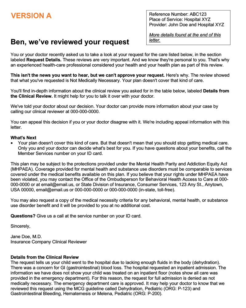
A major health insurance company approached me about overhauling its UM denial communication to improve member perception — once in 2019 and again a few years later.
I focused on bringing plain language and brand voice into the communication during the first rework. In the second, I built on previous enhancements by concentrating on showing empathy, further simplifying the messaging, and reorganizing information to improve member access and overall experience.
My goal was not to strong-arm the member into feeling joy upon learning their insurer wouldn’t cover their care. Instead, it was to:
- Make it easier for the member to understand what was happening and to find information.
- Make options and next steps apparent.
- Help the member feel confident in their ability to handle the situation successfully on their own.
The next parts of our discussion describe the various stages of the work, the results, and how I used fresh insights to develop the final version of the communication. But before we go any further, it’s important to give credit to the people who developed the original UM denial.
Experienced professionals did their best with a very challenging piece of work and delivered what was right at the time at that insurance company. It was a massive undertaking that required considerable expertise, data, and cross-functional stakeholder involvement. Their partnership and commitment to continuous improvement made the rewrites possible.

Day one: hypothesize and rewrite
Developing hypotheses is a great way to connect your work to a purpose and learn whether it connects as anticipated. I looked at members’ functional and emotional needs through an empathic lens, balanced those needs with the business’s new consumerism goals and its adjusted brand voice, and then put the following hypotheses together:
- Further humanizing and demystifying the UM review process will improve perceived empathy and compassion.
- Increasing the use of plain language (wording and visual design) will improve perceived clarity and ease of doing business.
- Reorganizing the communication to better deliver the information the member needs right away will improve perceived clarity and ease of doing business.
I then rewrote and reorganized the communication completely, keeping it aligned to a structure that would not only enhance member comprehension and experience, but also deliver measurable ROI to the business.
People who understand what they’re reading and can find the information they need on their own don’t call the company to bail them out — or to complain. Each phone call to the insurer’s support team costs the company a certain dollar amount.
Successful call-volume reduction can return millions of dollars to the bottom line quickly. That’s the ROI. And it is entirely possible to build an objective attribution model that shows improved content led to a drop in calls.
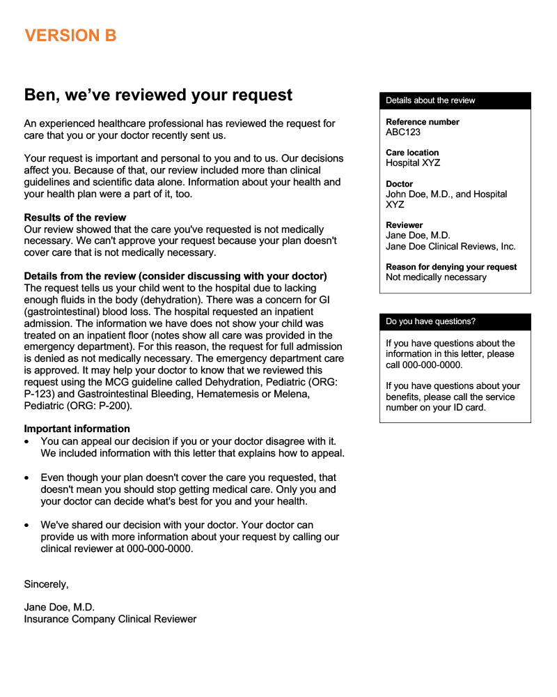
See an overview of enhancements
- Page one acts as a cover letter that shares only what the member values most.
- Legal, regulatory, contractual, and technical content move onto subsequent pages that the member may choose to read.
- The simplified introductory paragraph clarifies the purpose of the communication and explains concisely what’s happening in the moment.
- The second paragraph expresses empathy, uses a more supportive brand voice, and takes a calmer tone.
- The third paragraph describes the company’s decision in a relatable way and eliminates the need for the member to look for information.
- Moving the denial rationale up makes it more accessible. (The denial message changes from case to case. The company’s clinical organization owns it.)
- The last section presents scannable, bulleted information the member may need sooner than later.
- The sidebar uses color to draw attention to important details, including how to reach the company for support.

Day two: test the content
Testing included the 2019 rewrite (Version A) and the proposed new communication (Version B). It also asked respondents about perceived clarity, compassion, ease of doing business, and empathy. The A/B test gathered actionable insights from a large sample population (n=1000) in one business day.
Samples of Version A and Version B appear below. Both are cleansed of brand-specific details. Click or select a thumbnail image to see it at full size. It will open in a new tab or window.


Day three: see the results
Version B was the clear winner. It delivered significant percentage increases in audience perception across all four areas included in the A/B test:
- Clarity: +12%
- Compassion: +8%
- Ease of doing business: +31%
- Empathy: +33%
Remember, the test involved letters from a health insurer that say the insurer won’t cover the cost of a person’s healthcare.
How communications impact perception
If your communication is accessible, relatable, and actionable, then most of the negative feedback you’ll hear will focus on issues outside of the messaging and, typically, outside of what the marketing or communications team owns.
- Business decisions. The price of health insurance is too high.
- Experiences. Customer support kept me on hold for an hour.
- Biases. I don’t trust any health insurance companies at all.
Want proof? Consider the following feedback from respondents about Version B, the proposed new communication. The positives focus on the messaging, while the negatives concentrate on the business decision.
Positive:
- “The letter was clear enough for me to understand that the request was denied due to it being unnecessary. It sounds compassionate and empathic while still maintaining professionalism.”
- “I think the letter is well worded. I’m sure someone would be mad at the denial, but having it communicated in a proper way does help.”
Negative:
- “This should not exist. That’s the only way to make this compassionate. If my doctor and I decide that medicine is necessary, the insurance that I pay for should cover it. That’s the whole point of health insurance.”
- “Insurance denied coverage because of a technicality…. Insurance clearly doesn’t care and doesn’t want to pay.”

Day four: develop the final version
Version B was the new champion, but it wasn’t quite ready to defend its title. Why not? Because fresh insights from the test pointed out a few more opportunities to further improve the communication:
- Make denial details/rationale more prominent.
- Prioritize next steps/actions for appealing the denial decision.
- Remove statements that seem to be in contradiction, such as: Your plan doesn’t cover this kind of care. But that doesn’t mean that you should stop getting medical care.
This feedback makes sense when you exercise cognitive empathy — that is, taking the audience’s perspective and making it your own. For example, if you were reading the denial letter, what (rational and legal) action would you most likely want to take first? You’d want to fight the decision by filing an appeal. A significant number of respondents said that’s what they’d want to do.
Letting people know on page one instead of on page 17 that they can appeal the denial decision is part of reflecting cognitive empathy in the messaging. The other part is sharing how to appeal. As a result, the cover letter advises about appealing, and a plain-language guide to filing an appeal immediately follows the cover letter.
See tips about working with feedback
You may think that you need to bring all of the feedback you receive into your work, or that you have to take every verbatim comment you read to heart. Don’t attempt to do either; otherwise, you’ll never finish your work.
Quantity serves as a guide to prioritizing what goes into the final round of revision. If you see lots of feedback about a particular aspect of the communication, that’s a great start. If you survey 1,000 people and 60% (600) say you need to mention appeals sooner, then mention appeals sooner.
Passion is another indicator. It’s not perfect, but if you can use it to complement quantity, then you’re on track to making a data-driven decision of very high quality. Don’t overthink it, and don’t overdo it.
The words love and hate are more passionate than like or dislike. Profanity is another example of strongly passionate language.
To sum it up, the more you see a certain topic in the feedback, and the more passionate the feedback is, the more you need to use it to guide your work.
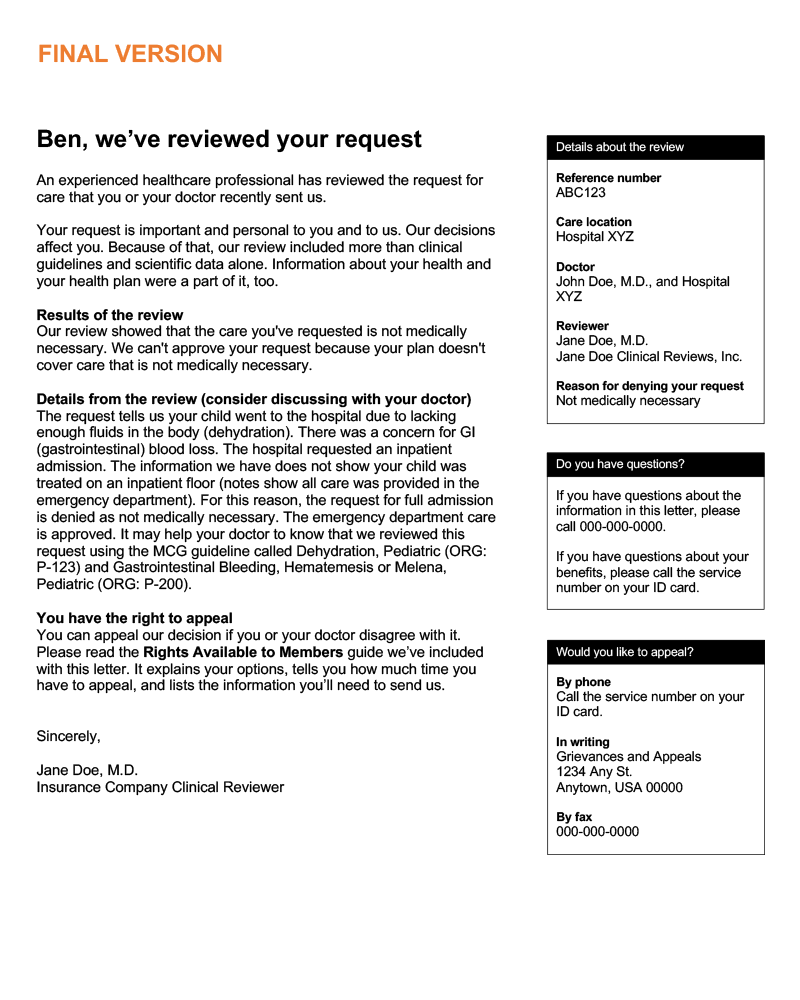
The final version of the UM denial communication:
- Humanizes the review process and shows empathy while upholding the intent of the communication.
- Provides information members need right away: the decision, denial rationale, and their right to appeal the denial.
- Summarizes important review information, contact information for support, and contact information for appeals up front, in the sidebar.
- Organizes the communication into a cover letter with enclosures vs. one long, continuous communication.
A sample of the final version appears below. The sample is cleansed of brand-specific details. Click or select the image to see it at full size. It will open in a new tab or window.


Minimizing the heat
The path of putting the customer first, taking their perspective, and reflecting empathy in communications is one that leads to the kinds of results you’ve seen here. Don’t bet on bad news ever making anyone happy. Instead, invest in continuous improvement in content.
If you have questions or would like more information, please contact me.

